Wide-Format Proofing for Beginners: A Sign Shop Guide
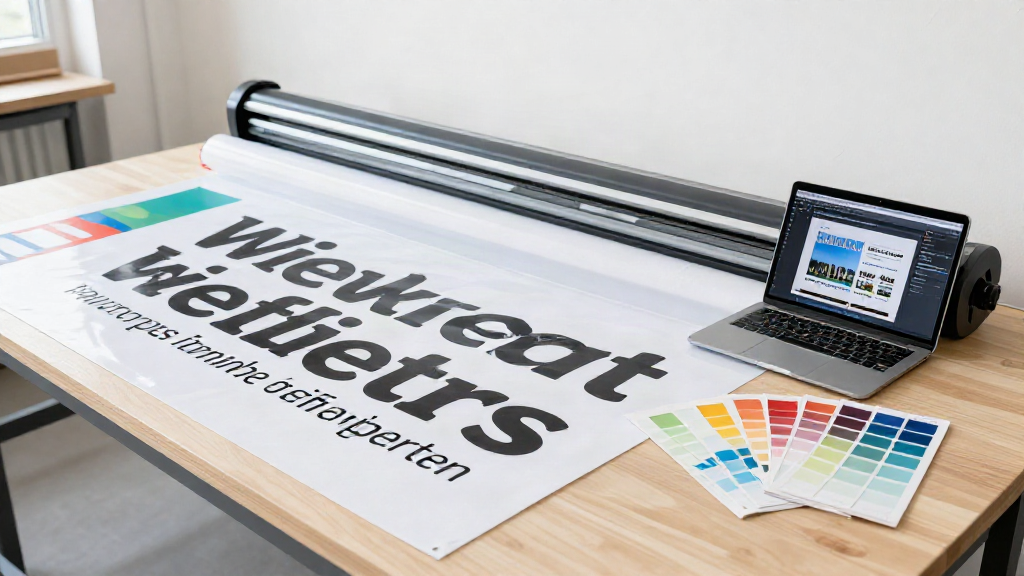
Your first wide-format job has just come off the plotter, and the client is standing in your shop looking at a three-metre banner with a typo the size of a dinner plate. Wide-format proofing exists to stop that moment happening. This guide covers what wide-format proofing is, why it behaves differently from the paper proofs most shops start out with, and how to build a sign-off flow you can run from your very first job.
What wide-format proofing actually means
Proofing is the step between finishing a design file and committing ink, vinyl, or substrate to a full-size run. Wide-format proofing applies that step to large work: banners, vehicle wraps, window graphics, rigid signage, exhibition panels, and anything printed or cut beyond a desktop sheet size.
The purpose is simple. Make sure the client sees exactly what they are going to get, in a form they can understand, before your machine spends material on it. A proof is not a rough idea of the final job. It is the record of what the client agreed to.
For a sign shop, that record matters more than it does for most print work. Jobs are one-off or low-volume, materials are expensive, and reprints cost far more than the original run. There is rarely a second chance to get a large sign right.
How wide-format proofs differ from standard print proofs
If you have come from commercial printing, the habits you built there do not transfer cleanly. Four differences catch beginners out:
- Scale. A desktop printer proof and a five-metre banner cannot be viewed the same way. The sign will be seen from metres away, so resolution, text size, and contrast all read differently at full size.
- Substrate. Paper is predictable. Vinyl, mesh, acrylic, foamex, correx, and fabric each change how ink looks, how colours sit, and how the finished piece behaves outdoors.
- Viewing conditions. A wall sign is seen in daylight; a window graphic is backlit from one side and reflected on the other. Colour that looks right on screen can look wrong on a substrate in situ.
- The client. Most sign clients are not designers. They cannot read a colour-managed PDF, and they will not open an account on a project tool to approve one. They want to look at a picture and say yes.
The three things that go wrong without a structured proofing step
When a proof is skipped, rushed, or buried in an email thread, the same three failures show up again and again.
1. Size and scale
The client approved a logo at the size it appeared on their phone. On a 3m building sign, it now dominates the panel, or the tagline that looked fine on screen is unreadable from the pavement. Size is the most common wide-format surprise because it is the hardest thing to judge from a small preview. A proofing step that shows the layout at true proportion - ideally against a familiar sense of scale - removes the guesswork.
2. Colour
RGB on a backlit monitor is not CMYK on coated vinyl, and neither is spot red on a matte banner. Colours shift with substrate, ink, and finish, and they shift more on large-format work because there is so much more of them to see. Without an agreed colour reference, the 'wrong shade' conversation happens after the job is printed, when the only fix is a reprint.
3. Material and finish
Was the client expecting gloss and got matte? Did they think the banner included eyelets and a hem? Is the panel 5mm foamex or 3mm correx? Material and finish decisions are easy to leave unspoken and expensive to correct. A structured proof captures the substrate and finish alongside the artwork, so the sign-off covers the whole job, not just the design.
How to set up a simple, client-friendly proofing flow
You do not need a heavy system to close these gaps. You need a repeatable path that a non-technical client can follow without an account and without a training call. Keep it to five steps:
- Upload the final artwork and note the substrate, size, and finish. One place, not three.
- Generate a proof the client can open in a browser - no login, no app, no password reset.
- Ask for the specific approvals you need: artwork, colour, material, size. Named decisions get answered; 'looks good?' gets ignored.
- Collect comments against the proof itself, so feedback is attached to the version it refers to.
- Get a one-click approval and keep the record, with a timestamp and a version history you can point to if there is ever a dispute.
The test of a good flow is simple: can your least technical client approve on their phone in under a minute, without you on the phone talking them through it? If the answer is no, the flow is doing too much.
Where ProofForge fits
ProofForge is built for exactly this kind of work. Upload artwork, send a branded proof link, and collect client comments and one-click approvals - no client account and no training required. Version compare shows what changed between rounds, AI artwork checks catch common file problems before they reach the press, and a full audit trail records who approved what, and when. For a shop taking on its first wide-format jobs, it is an affordable way to add a real proofing step without adding a project-management tool your clients will never open.
Start your first sign-off the easy way
Wide-format proofing is not about slowing a job down. It is about making sure the banner, wrap, or panel that leaves your shop is the one the client actually agreed to - at the size, colour, and material they expected. Get a plain-language proof in front of the client early, ask for named approvals, and keep the record. Do that consistently and your first client sign-off, and every one after it, stops being a risk and becomes a routine.